
Quick answer: A poster is the cheapest layer of an open day campaign, and the only one that puts a member of your staff face to face with the nurseries feeding next year's Reception class. Keep it to one big photograph of children looking at the camera, the date (or dates), and three ways to book. Add any short text that really helps answer key questions, but don't overcrowd it.
The hard part is knowing where to put it, and that's now a ten-minute job: paste the prompt in this article into ChatGPT, Claude or Gemini with your postcode, and it builds you a named local distribution list. Verify it before you send anyone out. As a rule of thumb, about fifty words works on a printed poster and six to ten in a social feed.
Our 2019 campaign was almost entirely digital. Website pages, Google, Facebook, Instagram. It worked, and we published every step of it here — what we've learned since 2019.
The thing we've added since is a piece of paper.
Not because digital stopped working, but because a primary school's catchment is about a mile wide, and within that mile there may be as many as fifty places where parents of three and four-year-olds physically congregate every week. Getting a poster into those places costs about £40 of printing and a couple of afternoons of somebody's time. Almost no school does it properly. We now strongly encourage our clients to take that time and effort.
Two honest caveats before we start. A poster on its own will not fill a class — it's one layer of several, and on its own it's the weakest of them. And the poster is only half the point. The other half is that somebody from the school walks into a nursery and introduces themselves, which is worth more than the paper they're holding.
The poster that works
Three rules, and everything else is detail.
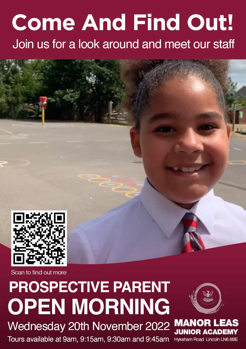
One big photograph of happy children looking at the camera. Not the building. Not the crest. Not a collage of six small images. A crowded noticeboard is a competition for attention and faces win it — particularly faces making eye contact.
Make it obvious what to do next. The second job of a poster is to get somebody to book. If a parent has to hunt for the date or work out how to register, they won't.
Don't overload it. The most common mistake is treating a poster like a prospectus. A parent walking past a library noticeboard gives you about two seconds. In that time they need to register: this is a school, it's near me, something is happening, and here's how to find out more.
The essentials:
The school name — and the logo small. Nobody picks a school by its crest
One line saying who it's for, so the right parent stops walking — is your child four next September?
One line about what makes the school distinctive — the thing parents actually mention on tours, not "outstanding education"
Two or three dates, with times. One date is a single point of failure — a parent who's working that morning is gone
Three ways to book: a QR code, a phone number, and a short web address
And on a printed poster only, two optional extras that earn their place:
One sentence on what the visit actually involves. "Come for a tour, meet the staff and talk to the children" tells a first-time parent what they're signing up to, and a lot of them have never been to one
One line that removes a real barrier, if you have one. For a faith school, we welcome children of all faiths and none — because plenty of parents assume they can't apply. For a school with a wraparound offer, say so. Only include this if the barrier is genuine; otherwise it's filler
What doesn't go on: the Ofsted rating, the uniform policy, the list of clubs, the results table. Those live on the page the QR code goes to.
Design the printed poster first. You'll want a stripped-back version of it for Facebook and for paid ads, and that's easier to cut down than to build up — there's a section on exactly how much to take off further down.
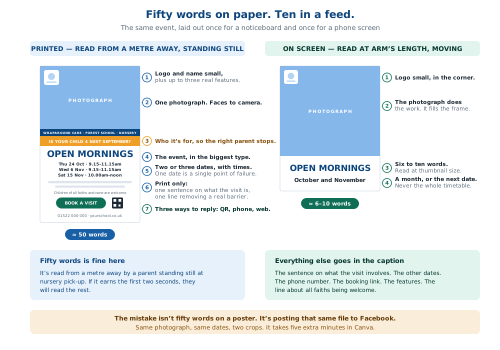
The same event, laid out once for a noticeboard and once for a phone screen.
How much text is too much?
This is where most advice goes wrong, including some you'll find in the templates floating around.
Word count is the wrong thing to argue about. What matters is how far away the reader is and whether they're moving.
A printed A4 poster on a nursery noticeboard is read from about a metre away by somebody standing still, often waiting for something. They'll give it two seconds to decide whether to keep looking — but if it earns those two seconds, they'll read on. That poster can carry about fifty words comfortably. A sentence explaining the visit, a line about all faiths being welcome, three dates and a phone number are all fine.
The same artwork in a Facebook feed is a different object entirely. It's two inches wide, held at arm's length, moving upwards, competing with a video of somebody's dog. Six to ten words get read. Everything else is decoration that makes the type smaller.
So the mistake isn't putting fifty words on a poster. The mistake is taking that same file — sentence, faith line, three dates, phone number and all — and posting it straight to Facebook, where none of it can be read.
Make two versions. Same photograph, same school, two crops. The printed one carries the detail. The digital one keeps the picture, six to ten words and a date.
On the digital version you might use a line like "Open days in September and October", or "Individual tours every week", rather than listing every date. Everything you've taken off — the sentence about the visit, the line about all faiths being welcome, the other dates, the phone number — goes into the caption underneath, or into the description field if you're running it as a paid ad. We cover the ad side in the Facebook ads guide. Facebook will let you write as much as you like down there, at a size people can actually read.
That's the whole of it. It takes about five extra minutes in Canva and it's the single most common thing schools get wrong with an otherwise decent poster.
Why most school posters fail
Stand in front of a nursery noticeboard and you'll usually find six or seven things competing for the same two seconds. School posters tend to lose that competition in one of four ways.
No photograph at all. A wall of text with a crest on top. There's nothing for the eye to land on, so the eye doesn't land.
A photograph of the building. Schools are proud of their buildings. Parents are not choosing a building.
A good photograph, but nobody is looking at the camera. Children from behind, children in the middle distance, children absorbed in an activity. It's a nicer picture and a worse poster. Eye contact is what makes somebody stop.
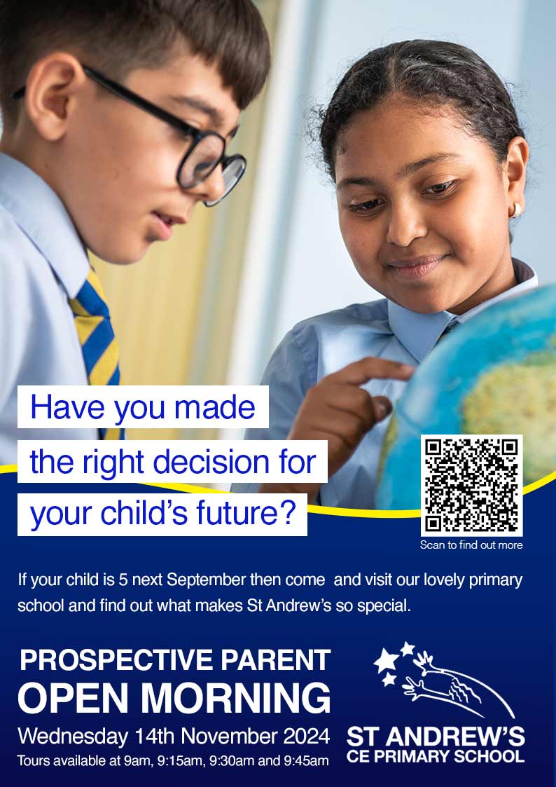
A good photograph, and then everything else as well. This is the one that hurts, because it started well. Ofsted grade, clubs list, uniform policy, three paragraphs of welcome. By the time it's finished it reads like a prospectus that's been shrunk to A4.
Here's the test, and it takes ten seconds. Pin your poster on a wall, walk to the far side of the room, and look at it for two seconds. If you can't say what it is, where it is and what you're meant to do next, it isn't finished.
If you haven't got a usable photograph
Most schools haven't, and it's the single biggest thing holding back their marketing. The photos in the newsletter aren't the photos that stop somebody in a corridor.
You can fix this in an hour. Pick a bright day, grab a handful of children whose photo consent is unambiguous, take them somewhere with decent light, and shoot a few dozen frames of them doing something they'd actually be doing — reading together, laughing, running. Then pick the one where somebody is looking straight down the lens.
Check the consent list first, not after. And if you want the version that works everywhere for years rather than just on this poster, that's what a proper shoot gets you — more on school photography here.
Making the thing
You don't need a designer, and you probably don't need a bespoke template either.
Canva has free open day poster templates, and so does PowerPoint. Any of them will do, because the layout isn't the hard part — the discipline is. Pick one with a large image area and a small amount of text, drop your photograph in, delete about two-thirds of the words the template came with, then add your dates and the three ways to book.
Then duplicate the page, crop it square, and strip it back to the least viable amount of words for the social version. Do it now while you're in there, not in October when you need it.
If you're using Canva, it will print and deliver them to you as well, which is often less hassle than the school photocopier and doesn't tie up an afternoon. They'll look better too!
Where to put it — and the prompt that works it out
Here's the part that used to take a couple of days, local knowledge, Google, and a map, but now takes just ten minutes.
Ask an AI to build the list. Any of ChatGPT, Claude or Gemini will do it. The trick is asking properly — a vague request gets you a vague list with invented addresses. This prompt is written to avoid that.
Copy everything in the box below, replace the bracketed bits, and paste it in:
I run marketing for a primary school and I need a distribution list for open day posters.
School: [SCHOOL NAME], [FULL POSTCODE] Radius: 1.5 miles Anything else worth knowing (optional): [for example — we are a Catholic school / we have a nursery on site / we are the only primary in the village]
Please search the web for current, real places within that radius where parents of three and four-year-old children physically go on a regular basis. I need to send staff to put A4 posters up, so accuracy matters more than length.
Cover these categories:
- Nurseries, preschools and childminder groups
- Parent-and-toddler groups and playgroups (including ones run in church halls and community centres)
- Public libraries, especially any running rhyme time or story sessions
- Soft play centres and indoor play cafés
- Leisure centres and swimming pools with children's classes
- Family-friendly cafés, particularly ones with buggy space
- Community centres and village halls
- GP surgeries and health centres with waiting areas
- Churches, mosques, synagogues and temples running toddler sessions
These are examples, not limits. Add anywhere your search reasonably suggests, thinking about where a parent or grandparent of a four-year-old actually spends time — grandparents do a lot of the pick-ups and the childcare, and they go to different places.
For each one, consider whether it is somewhere that would plausibly agree to display a poster. Prefer places with a physical noticeboard and a local manager who can say yes. Skip large chains where that decision sits at head office.
Present it as a table with these columns: Name · Type · Full address · Why it's relevant · Best day/time to visit · Verified?
Leave the "Verified?" column blank — I'll fill it in.
Important: only include places you can actually find evidence for. If you are unsure whether somewhere still exists or has the right address, say so in the row rather than guessing. I would much rather have twelve confirmed places than thirty where a third have closed.
Then, separately, give me a list of search terms I should type into Facebook to find local community groups where I could share the poster digitally — for example residents' groups, "spotted in" groups, local mum and parent groups, and village or neighbourhood noticeboards. Give me the search terms rather than group names, because group names change and you can't verify them.
Then verify it
This is not optional. Every one of these tools will occasionally produce a nursery that closed in 2022 or a library with last decade's address. Sending a member of staff on a wasted trip is annoying; sending them somewhere that no longer exists, in the school's name, is a small embarrassment.
Half an hour with the list open and a map or a phone will confirm most of it. Delete anything you can't stand up. A verified list of twelve is worth more than an unverified list of thirty.
Getting them up
Give it to one person. A poster run that belongs to everybody happens to nobody. It's an afternoon's work for one member of staff, ideally somebody cheerful.
Batch it geographically. Group the list into three or four short routes rather than criss-crossing the catchment.
Introduce yourself. This is the bit that pays off later. A nursery manager who's met somebody from the school is a nursery manager who mentions the school when parents ask which primary to choose. The poster is the excuse for the conversation, and the conversation is worth more than the poster. Every one of those nurseries is feeding children into somebody's Reception class next year.
Take something. A box of biscuits, chocolates or doughnuts for the staff room costs almost nothing, and it's often the difference between a poster that's still up at half term and one that's been covered over by a swimming timetable.
Log where each one went. You'll want the list again next year, and it saves rebuilding it from scratch.
And send it to the parents you already have
The cheapest distribution list in the school is the one already sitting in your messaging app.
Send the artwork to current parents — ClassDojo, Arbor, ParentMail, whatever you use — and ask them to pass it to anyone they know with a three or four-year-old. Parents of children already at the school are the most credible advocates you have, and a good number of them have younger siblings, neighbours and friends in exactly the right age band.
Print a few extra and leave them by the door for anyone who wants to take one. It costs nothing, and it's the only channel where the recommendation arrives with a name attached to it.
The same poster, working online
Design it once, use it four times — with the crop and the wording adjusted each time, as above.
That artwork is also your Facebook and Instagram post. Put it on the school's own page and profile, then share it into every local community group that allows it — the residents' groups, the village noticeboards, the "spotted in…" groups where local parents actually scroll. That's the second list your AI prompt produced.
Then it's your paid ad creative too, using the stripped-back version — we cover that in the Facebook ads guide.
And if you've got digital screens near you, portrait screen formats are close enough to A4 that the printed version adapts with a resize — more on that here.
One shoot, one design session, working on noticeboards, in feeds, and on screens.
There may well be other online sites such as Nextdoor where it might be worth placing the same digital version of the poster. And you also might find that existing parents are in local WhatsApp groups. We know that some of our clients have tried spreading the digital version of the poster in that way and they felt it was worthwhile.
Can you tell whether it worked?
Partly, and it's worth setting up before you print rather than wishing afterwards.
Use a QR code that goes somewhere trackable — your visit booking page with a tracking tag on the end, so visits arriving that way show up separately in your website analytics.
Or use different QR codes for different venue types — one for nurseries, one for libraries, one for cafés. Free to generate, and after one season you know which category of venue is actually worth the shoe leather. That does add to the poster cost if you're doing it with a printer, but not if you're running them out on the school copier.
And ask. "How did you hear about us?" on your booking form and your tour check-in sheet is the only way to catch the parent who saw the poster, remembered the school, and googled it three weeks later. Which is most of them. The same problem applies to radio and audio.
Where this sits
Posters are one layer of the visibility stage of the system we use to fill school classes — alongside local social, targeted advertising and, where it makes sense, screens and audio. The whole thing is documented in our published case study and in the Fill Your Class Funnel.
If you're not sure whether visibility is even your problem, that's what the Marketing Health Check answers before you spend anything.
Frequently asked questions
What should a school open day poster include?
One large photograph of happy children looking at the camera, the school name with a small logo, one line saying who it's for, one line on what makes the school distinctive, two or three dates with times, and three ways to book — a QR code, a phone number and a short web address. On print you can also add one sentence on what the visit involves and one line removing a genuine barrier, such as welcoming children of all faiths.
How much text should be on a school open day poster?
About fifty words on a printed A4 poster, which is read from a metre away by somebody standing still. About six to ten words if you're putting the same artwork in a social media feed, where it's two inches wide and moving. Make two versions rather than compromising with one.
Why do most school open day posters not work?
Four reasons: no photograph at all, a photograph of the building rather than the children, a photograph where nobody is looking at the camera, or a good photograph buried under prospectus-style text. Test yours by pinning it up and looking at it from across the room for two seconds.
Do I need a designer to make a school open day poster?
No. Free templates in Canva or PowerPoint are fine — the layout isn't the hard part. Choose one with a large image area, drop in your photograph, delete most of the template's text and add your dates and booking details. Canva will print and deliver them too.
Should a school open day poster have one date or several?
Several. Two or three dates with times, ideally including one that works for parents who are at work in the mornings. A single date is a single point of failure.
Where should schools put open day posters?
Where parents of three and four-year-olds already go: nurseries and preschools, parent-and-toddler groups, libraries running rhyme time, soft play centres, family cafés, leisure centres with children's classes, community centres, GP waiting rooms and places of worship running toddler sessions — all within about a mile and a half of the school. And send it to your existing parents to pass on.
How do I find local places to put school posters?
Ask ChatGPT, Claude or Gemini to search for them, using a prompt that names your postcode, sets a radius, lists the venue categories and asks for a table with full addresses. Then verify each entry before sending anyone out — AI tools will occasionally list places that have closed or give an out-of-date address.
How do you measure whether posters worked?
Point the QR code at your visit booking page with a tracking tag so those visits show separately in analytics, and consider using different QR codes for different venue types so you learn which are worth repeating. Then ask "how did you hear about us?" on your booking form and check-in sheet, which catches everyone who saw the poster and searched for you later.
Ian Clifford is the co-founder of School Marketing Works and has been running admissions campaigns for UK schools since 2018, including the one documented in our published falling school roll case study.